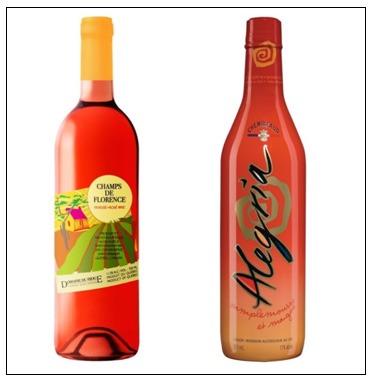
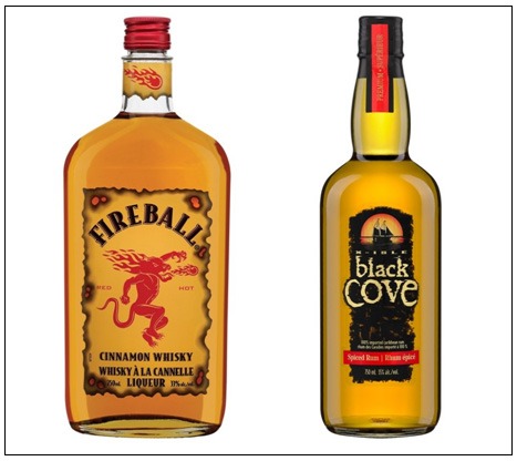
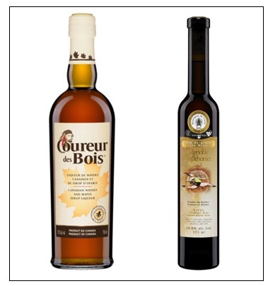
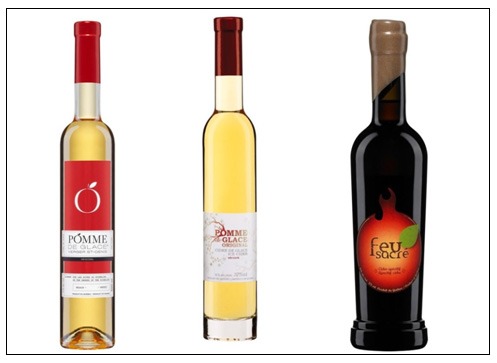
We often see winning wine labels (the most elegant, the most original, the most colourful, etc.), but we rarely see winning labels of products from Quebec. When looking at pictures of bottles of wine, alcohol and spirits made by local companies, I was surprised by the visual quality of the labels. So I decided to show you some examples. What’s important isn’t the product inside the bottle; this is rather an “homage” to the most appealing labels of products from Quebec.
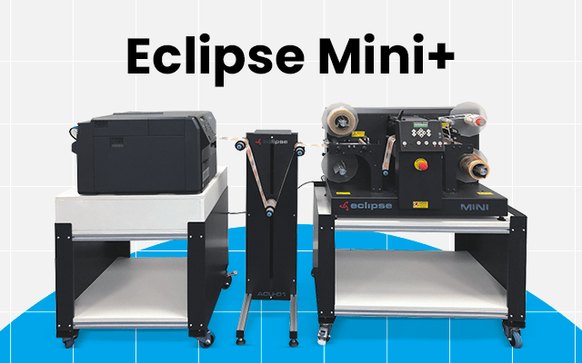
Recently, I learned from my colleagues that IMS perfected a solution for labelling and applying semi-automated labels for wine bottles. They worked hard so that this solution, first considered useful for vineyards and other wine and local alcohol producers, could be presented to visitors at the PACKEX Toronto trade show, from May 14-16, 2013. Meanwhile, feast your eyes (no drinking glass required) on these labels!
The Fireball whiskey and Black Cove spiced rum are based on the pirates theme with an old treasure map background. The first, which portrays a devil, alludes to many legends from the region; the second, with its dominating black colour, depicts a pirate atmosphere.
Race pace!
The Coureur des Bois is Canadian whiskey mixed with maple syrup, with an outdated look that opens a page to our wonderful history. And ice wine, from the Vignoble du marathonien, portrays its original character that’s quite different from classic branding.
The rosé wine, Champs de Florence from the Domaine du Ridge, is sold in a bottle where both the labels on the bottle and on the neck have sunny colours. The Chemineaud Alegria has colours that are just as bright; the only difference is that its label is a sleeve.
Starring the apple!
The Pomme de glace du Verger St-Denis, the Pomme de glace du Domaine Pinnacle and the Feu sacré du Verger Lacroix all have something in common: the apple. The first two labels, more classic, are both poetic and sophisticated. The third, with more sparkle, depicts a more modern and energetic version of an apple.
Cold front!
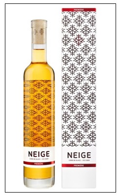
The last example is its category’s only member. I wanted to highlight the very interesting use of the label on the back of the bottle, which contains printed patterns of snowflakes that can be seen, clearly enough, through the ice cidre Neige de La Face cachée de la pomme.
Although the labels I chose to show you were not produced by IMS, the fact remains that it is part of our daily routine. I see very colourful labels on our presses all the time and no idea is too unusual or absurd to be carried out. What we hope for when we do this kind of project is that consumers will be as impressed with the bottle as they are with its content. Call us to discuss your projects, whether it’s about wine labels or other products. Our specialists are eager to help you!

