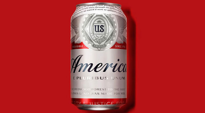
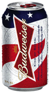
Lately in the news, Budweiser has been the talk of the town as they announced swapping in the word “America” for “Budweiser” on its cans and bottles (temporarily) for their world-renowned flagship beer. This is the boldest rebranding campaign Budweiser has ever undertaken as historically, it usually goes red white and blue in time for Independence Day, July 4th.
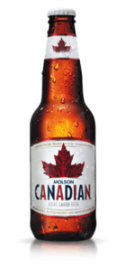
Mind you, Molson didn’t have to change the name of its Molson Canadian product for Canada Day, July 1st!
Dressing up for an event
This bold redesign is not new in the market. Spectacular indeed, but you probably noticed that brands and smaller players take advantage of peak moments of the year such as national celebrations and holidays to put out new packaging and engage consumers through emotional appeal.
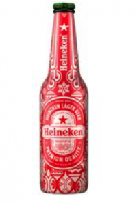
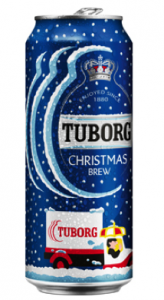
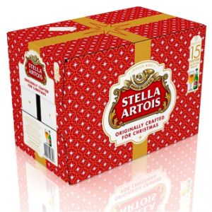
Think of Christmas Day. Beer makers make sure to be part of the celebrations with themed designs to entice consumers into sticking with them for the rest of the year.
Here are some festive examples:
A little “je ne sais quoi”
There are many ways to design your event related packaging and labeling. Think of adding an extra special pressure sensitive label to your existing bottle or packaging. That could do the trick quickly and easily.
Shrink sleeve the cap or the top half of the bottle with vivid colours and an appropriate message. Take advantage of the reverse of the sleeve jacket.
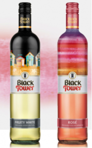
Here is a nice example by Black Tower wine where a fun beach hut designed sleeve was added to top the bottle.
While you’re at it, consider a promotion using a peel-back label or sleeve. Well-designed packaging is an opportunity to get playful and interact with consumers.
Limited editions
No events seem related to your product? Why not go for limited editions?
Be it fashion, social causes or the arts, get creative and go for designs that will make you stand out on the shelf.
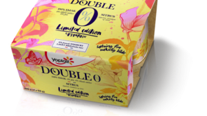
Take for example this yogurt brand called Yoplait that partnered with a renowned illustrator to design a limited edition packaging.
The brand stays recognizable but the packaging is artsy, inviting and different. Compared to other products of the same category in the dairy section, one can appreciate the quality of the art and be attracted to it at the same time.
So… start now!
Take some time to do your research and walk your grocery’s alleyways with a different eye. Take a look at your calendar and identify moments where your product could be presented in a limited edition or take advantage of an event for a special launch.
Get creative. Talk to us in the process so we can help you bring your project to life!

