We live in a world where personalization is the key to your product’s and your company’s success.
Your product’s packaging is your first marketing tool, and it’s main objective is most likely to stir the emotions of it’s intended target.
That said, more and more brands customize their packaging according to gender: male or female. This is made possible by the many options customization can offer: form, design, color, typographies, logo, messages, slogans …
Personalization is a niche to invest in to attract and retain new consumers. Consumers want to be able to recognize themselves through the packaging of your products. Read our post about the importance of the visual impact of your packaging.
Why customize your packaging and labels?
Men and women have different tastes, a packaging can please and influence the act of buying of a woman while a man would not be attracted at all by the same product.
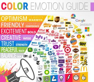
The human being reacts specifically to a product, a packaging. Colours are known to represent specific states of mind and emotions. Here are some of the more well known “states of mind” associated with colours
The influence of colors
- Yellow: optimistic, young and attractive
- Red: passion, energy, love, urgency
- Blue: confidence, security
- Green: health, environment, quiet
- Orange: aggressiveness, call to Action
- Pink: feminine, romantic
- Black: powerful, strong, luxury
- White: purity, softness, freedom
- Mauve: quiet, soft
(Source image ©thelogocompany)
The Power of Words
The words on your packaging labels can have a very big influence on your buyers. Indeed, a packaging with “eco-friendly, biodegradable …” mention, will have a greater impact for some people and for others, not. Also, using words like « discount, free, new, easy …” usually causes a different behavior towards a product.
Now that we’ve introduced some of the basic concepts of how customization applies to your packaging, here are some examples of products aiming for gender specific targets (male or female).
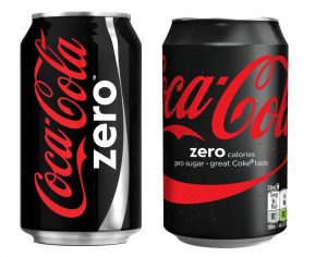
A bottle of Coca-Cola especially for men
This Coca-Cola Zero bottle/can, has been specially designed to seduce a male audience. While the light version (bottle or grey can) was more appealing to a female target, the brand saw an opportunity to touch men with darker packaging, black representing masculinity, manhood. Thus, the brand, thanks to this change of color and the slogan “The taste of Coca Cola but without the calories” managed to conquer a male target.
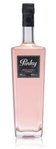
Pinky vodka: the bottle of vodka for women
The Pinky Vodka brand is sold in this pink colored bottle. It’s not difficult to understand that this product targets a female target. The product could almost be compared to a bottle of perfume. The bottle’s pink color combined with an elegant black label, represents luxury and femininity.
Customize your packaging and labels!
Today, more than ever, it’s essential to address the right target Are you doing this effectively? Contact us and let’s talk about it!

