Sometimes people think consistency is boring. When it comes to building a brand, consistency is anything but that. It’s actually vital.
Good brands tell a story. In any good story, new information must be added to advance the story, but certain basic elements, such as the main characters, will remain the same. Changing too many things at once will cause confusion and loss of interest. A good brand telegraphs its message; it can be recognized in an instant. Only consistency can get your brand there.
Take the example of the Petro-Canada logo: that familiar partial rendering of a white maple leaf. Seen on a tall roadside sign, every driver can identify it immediately, with no need to even read the name beneath. But imagine if that symbol had been applied inconsistently over the years. If some filling stations had the leaf in another colour, for example, or if some had more or less of a complete leaf – instant recognition would not exist today.

How does this apply to labels? Your labels must identify your products but they also identify your brand. Different products should have different labels, but they should also have common elements that instantly identify them as being from your company – from your brand. At IMS, we recognize this beyond just what it means to the design of a label. We can recognize the possibilities of consistency and variation in the actual production of labels. Here are two examples.
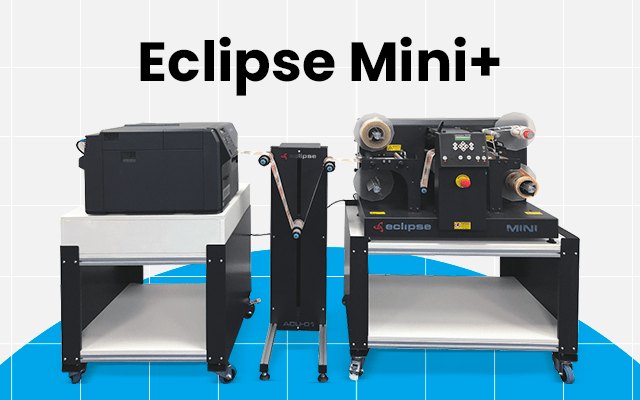
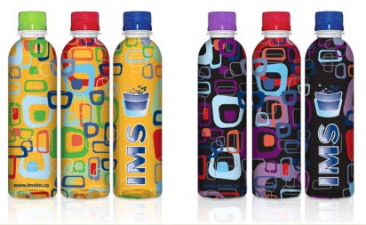
- One IMS customer produces different varieties of honey in jars. His labels are produced by IMS’s flexographic presses. Because our flexo printing allows a colour plate to be changed, a single large run of labels can be sub-divided into the same design rendered with different colours in one element of the design. This provides the client with an immediate cost-savings because they can take advantage of the economies-of-scale a large label run enables, but they still get a few different iterations of that label to identify different products of theirs. But there is an additional benefit to the client’s brand image. Consumers will see the same label design, beyond just the same logo, and recognize it as the same brand even when they see it with one key colour changed. The overall image is consistent, and the brand will therefore be more memorable, even while the brand’s story (in the form of different products) moves forward.
 Several products of the same brand portrayed in different colors
 Several products of the same brand portrayed in different colors
- The same can apply with an IMS client who orders large rolls of pre-printed labels that feature a blank, printable area. The client can then use a desktop thermal transfer printer to customize those labels for individual product varieties. Today’s desktop industrial printers can produce much more than a simple barcode. Product names and even images can be produced. Again, a portion of the label will change while the majority remains consistent, with the latter being the key to cementing the brand in consumers’ minds.
Do you have any experiences where consistency, or a lack of it, influenced the acceptance of a brand? Not sure how your own current label design can be made to incorporate some variety while still remaining true to brand? Ask us below.