Unless you’re a start-up, chances are your company already has an established logo. The colour or colours used in your logo are the primary colours of your brand. So, what does that colour choice signify?
Aside from individual preferences, colours can convey different meanings to large groups of people. For example, why does IBM use blue, to the point where they are nicknamed Big Blue?
The colour is seen as peaceful, universally well-liked, and it traditionally conveys trustworthiness, financial security, and dependability.
Then why would UPS use brown?
As the colour of earth – the soil – brown suggests keeping things simple, along with stability, durability, and permanence, which are desirable characteristics in a package delivery company. Besides, brown has a practical use as well, as it keeps trucks and uniforms looking clean.
When designing a label or package, keep in mind your brand colours and be sure to work with them. Within reason, repeating the same colour or colours from your brand can add to an overall integrated look. However, using only those colours may be overdoing things, depending on the design that’s involved. This is especially true if you have just one colour in your brand. But adding other colours can be perilous, so it’s wise to work with a competent design professional as well as ask for some different opinions on colour choices – at least among your close colleagues.
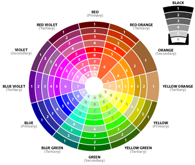
Most people are familiar with the colour wheel, either the one with primary colours or the one below.
Generally speaking, contrasting colours –those on opposite sides – work well together, as do complementary colours, which are about a quarter of the distance around the wheel from each other. Colours that are considered clashing are located close to each other on the wheel.
As a label company that utilizes flexographic printing, IMS can work with you for economical production of the same basic design rendered with different colours. This can be tremendously useful for branding different product lines while keeping the same overall design and keeping production costs in check. But keep in mind that not every colour combination works well. That’s why we strongly encourage our clients to work with a professional designer. Or, if they don’t already have one, we can suggest a few people to contact. The wrong colour combination on your product label or package design can damage your sales and your brand. Done right, however, it can strengthen both.
Source for colour meanings: “Your Brand’s True Colors” by John Williams
http://www.entrepreneur.com/article/175428
Do you have questions about the use of colours or an experience to share? Tell us below.


